
DataGrid
DataGrid<TRow> builds a browser table from an array of GridColumn<TRow> declarations. A single declaration defines the header, displayed value, sorting, filtering, CSS class, and export value, so these representations remain consistent when the column set changes.
Creating a grid
DataGrid clears the supplied head and body and then manages their contents. Both sections must exist in the markup:
<table id="orders" class="orders-grid">
  <thead></thead>
  <tbody></tbody>
</table>
import {
  DataGrid,
  GridPinnedPlacements,
  SortDirections,
} from '@stocksharp/grids';

interface Order {
  id: number;
  symbol: string;
  side: 'buy' | 'sell';
  price: number;
  volume: number;
  board: string;
}

const table = document.querySelector<HTMLTableElement>('#orders')!;
const grid = new DataGrid<Order>({
  head: table.tHead!,
  body: table.tBodies[0],
  columns: [
    { key: 'id', header: 'No.', value: order => order.id, filter: 'number', exportable: true },
    { key: 'symbol', header: 'Instrument', value: order => order.symbol, filter: 'text', exportable: true },
    {
      key: 'side',
      header: 'Side',
      value: order => order.side,
      text: order => order.side === 'buy' ? 'Buy' : 'Sell',
      render: order => order.side === 'buy' ? 'Buy' : 'Sell',
      cellClass: order => order.side === 'buy' ? 'side-buy' : 'side-sell',
      exportValue: order => order.side === 'buy' ? 'Buy' : 'Sell',
      filter: 'set',
      exportable: true,
    },
    { key: 'price', header: 'Price', value: order => order.price, filter: 'number', exportable: true },
    { key: 'volume', header: 'Volume', value: order => order.volume, filter: 'number', exportable: true },
    { key: 'board', header: 'Trading board', value: order => order.board, filter: 'set', exportable: true },
  ],
  defaultSort: { col: 'id', dir: SortDirections.Desc },
  rowKey: order => String(order.id),
  emptyText: 'No orders',
  locale: 'en-US',
  reorderable: true,
  filtersVisible: true,
  selection: 'multi',
  selectedClass: 'is-selected',
  contextMenu: true,
  pinnedRows: () => [{
    key: 'total',
    className: 'grid-total',
    place: GridPinnedPlacements.Bottom,
    cells: [
      { content: '', className: '' },
      { content: 'Total', className: 'grid-total-label' },
      { content: '', className: '' },
      { content: '', className: '' },
      { content: '150', className: 'grid-total-value' },
      { content: '', className: '' },
    ],
  }],
});

const orders: Order[] = [
  { id: 101, symbol: 'SBER', side: 'buy', price: 312.45, volume: 100, board: 'TQBR' },
  { id: 102, symbol: 'GAZP', side: 'sell', price: 164.18, volume: 50, board: 'TQBR' },
];

grid.setRows(orders);
rowKey must return a unique, stable key. The grid uses it to preserve selection after a redraw and to find elements through rowElement() and cellElement().
Column definition
The main GridColumn<TRow> fields are:
key— a permanent column identifier;header— an already localized header;value(row)— the value used for sorting and, by default, for display and export;render(row)— a string or DOM node for the cell;text(row)— a textual representation of the value for groups, set filters, and the context menu;cellClass(row)andbindCell(td, row)— cell styling and event handlers;filter— the filter type:text,number, orset;exportableandexportValue(row)— inclusion of the column and a separate value for.xlsx.
If render() returns a Node or DocumentFragment, the component inserts it into the cell as DOM rather than as an HTML string. This makes it possible to create buttons safely and attach handlers through addEventListener.
Sorting, filters, and grouping
Clicking a header cycles sorting through “ascending → descending → default order.” Empty values remain at the end in both directions. Text is compared by Intl.Collator for the language specified by locale; if the option is omitted, the document language is used.
Quick filters appear in a row below the headers when filtersVisible: true is set. The programmatic API accepts serializable objects:
grid.setFilter('symbol', { op: 'startsWith', text: 'SB' });
grid.setFilter('price', { op: 'between', min: 300, max: 320 });
grid.setFilter('board', { op: 'anyOf', values: ['TQBR', 'TQTF'] });

const rowsAfterFilters = grid.filteredRows();
grid.clearFilters();
The available operations are contains, notContains, startsWith, endsWith, eq, ne, gt, ge, lt, le, between, anyOf, noneOf, empty, and notEmpty. An empty filter object is equivalent to no filter.
Grouping supports one level. Rows inside a group preserve the selected sort order, and groups can be collapsed:
grid.groupBy('board');
grid.toggleGroup('TQBR');
grid.groupBy(null);
Context menu and filter dialog
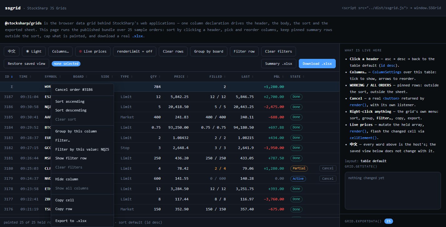
With contextMenu: true, the built-in GridContextMenu offers sorting, grouping, filtering by value, hiding and restoring columns, copying a cell or row, and exporting to .xlsx. A contextMenu object lets you customize CSS classes, labels, and the action list:
contextMenu: {
  classes: { menu: 'orders-menu', item: 'orders-menu-item' },
  labels: {
    sortAsc: 'Ascending',
    sortDesc: 'Descending',
    filterRule: 'Configure filter…',
    filterByValue: value => `Keep value: ${value}`,
  },
  items: (context, defaults) => context.row
    ? [
        {
          label: `Cancel order #${context.row.id}`,
          run: () => cancelOrder(context.row!.id),
        },
        {},
        ...defaults,
      ]
    : defaults,
}
The labels fields are optional: unspecified labels retain their default English values. To localize the entire interface, the application must pass all visible GridMenuLabels and GridFilterDialogLabels.
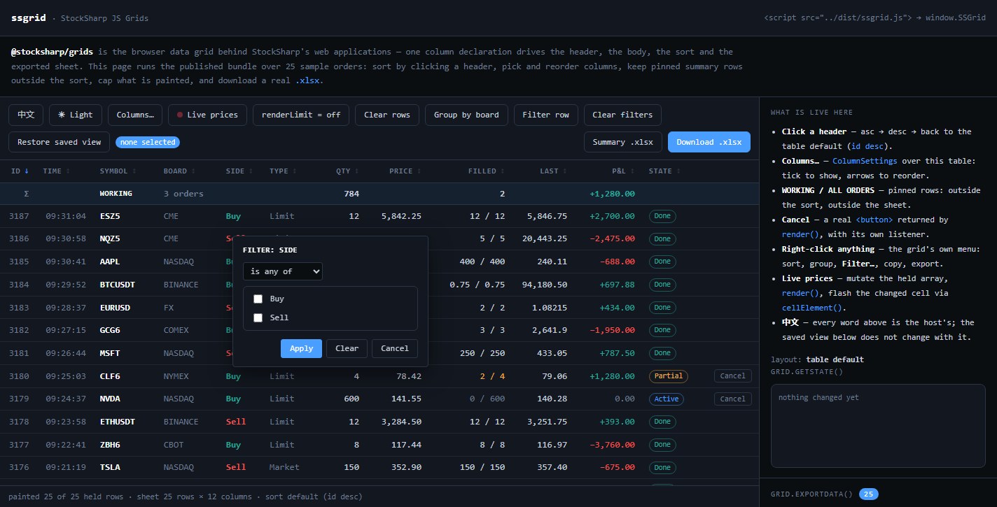
GridFilterDialog opens from the menu or through openFilterDialog(key, x, y). Unlike the quick-filter row, it lets the user select an operator and its operand. For a set filter, the dialog shows the values actually present. No more than one built-in dialog and one context menu can be open on the page at a time.
The menu and dialog components create markup and assign class names, but do not provide ready-made styling. The application must define the standard grid-menu* and grid-filter-dialog* classes or supply custom ones through classes.
The low-level classes are also exported from the package. GridContextMenu.open(items, x, y) displays an array of GridMenuItem objects, where an empty object acts as a separator, disabled disables an action, and checked marks an item. GridFilterDialog.open(options, commit) takes the column header from options.header, along with the filter type, current condition, value options, and coordinates; the commit function receives a new GridFilter or null when cleared. Both classes have an isOpen property and a close() method. They usually do not need to be created manually: DataGrid manages them through the contextMenu option and the openFilterDialog() method.
State and row selection
getState() returns a plain JSON-compatible object containing column order and hidden columns, sorting, filters, grouping, collapsed groups, and header and filter-row visibility:
const grid = new DataGrid<Order>({
  // Other options.
  onStateChange: state => {
    localStorage.setItem('orders-grid', JSON.stringify(state));
  },
});

const saved = localStorage.getItem('orders-grid');
if (saved)
  grid.setState(JSON.parse(saved));
Unknown column keys are ignored during restoration, while new columns missing from the saved order are appended after those listed. setState() does not invoke onStateChange, so loading does not immediately save the same state again.
Row selection is not part of GridState. To restore it, save the keys from onSelectionChange separately and pass them to setSelection(keys).
Live data and export
setRows(rows) replaces the row set and redraws the grid. The component keeps the supplied array by reference, so after changing its objects you can call render(). For a targeted update, use cellElement(rowKey, columnKey), and to find a row, use rowElement(rowKey).
renderLimit limits only the number of rows in the DOM. Filtering, sorting, and export still operate on the full set. afterRender() runs after each subsequent redraw and is suitable, for example, for resubscribing to instruments that are currently visible.
Pinned rows returned by pinnedRows() are read again on every render and do not participate in sorting, selection, or export. The exportData() method returns headers and rows without downloading a file, while download(baseName, sheetName) creates an .xlsx file.
Localization and instance cleanup
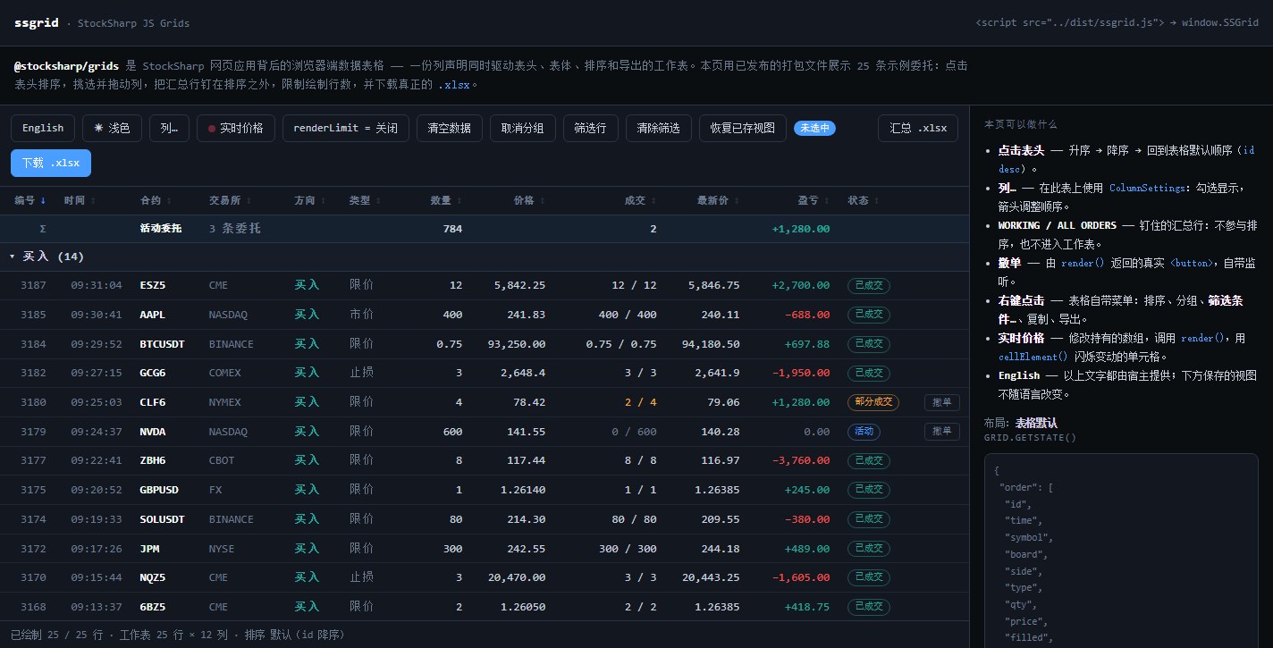
The package does not translate headers or values itself. The application supplies localized header, emptyText, text, groupHeader, menu labels, and dialog labels. State stores keys and source values, so it can be transferred to a new instance after the language changes.
Call destroy() before replacing an instance. The method removes the Ctrl+C handler from the document and closes open menus and dialogs:
const state = grid.getState();
grid.destroy();

const localizedGrid = createEnglishGrid();
localizedGrid.setState(state);